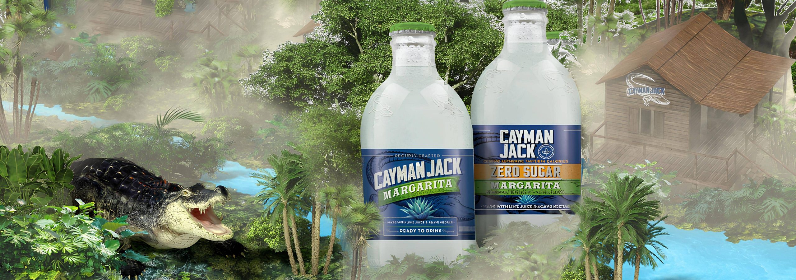
Client: Cayman Jack
Type: Augmented Reality
Deliverables: UX, UI, Art Direction, Branding
"Discover the
Legendary Taste"
Cayman jack and Atlas Obscura wanted to create an Augmented Reality experience that included a sweepstake for a once lifetime holiday giveaway. Both agencies were quite open as to how best achieve this in an AR enviorment but both put an emphasis on communicating the brand and reflecting the authenticity of each holiday destination.
IDEATION
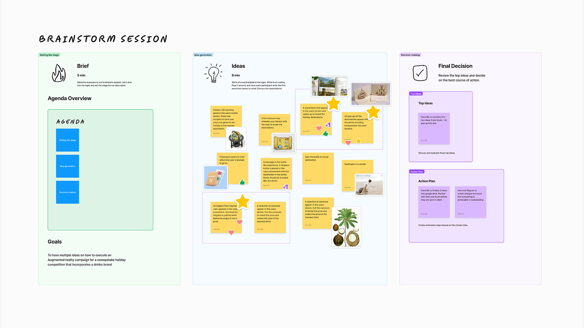
The project started with a design huddlle (One creative director, an associate creative director and 3 designers). An internal figmajam board was made and each creative had 5 mins to come up with ideas pinning sticky notes on how best they would execute the brief. After discussing the results the, we grouped them into an affinity diagram, added references and tweaked certain suggestions to adhere to the clients requests. Ultimately the creative director decided what would need to be worked on to put in a deck to show the sales team before its presented to the client.
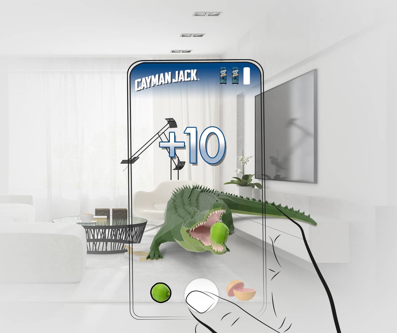
Route 1: Alligator Hour
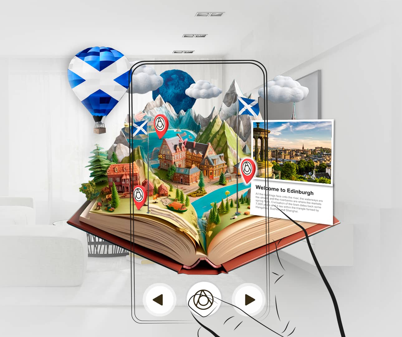
Route 2: Pop up Book - Clients preferred choice.
"Both agencies felt the AR travel book would work
very well in the AR experience and give opportunity
to highlight the brand and destinations"
USER JOURNEY
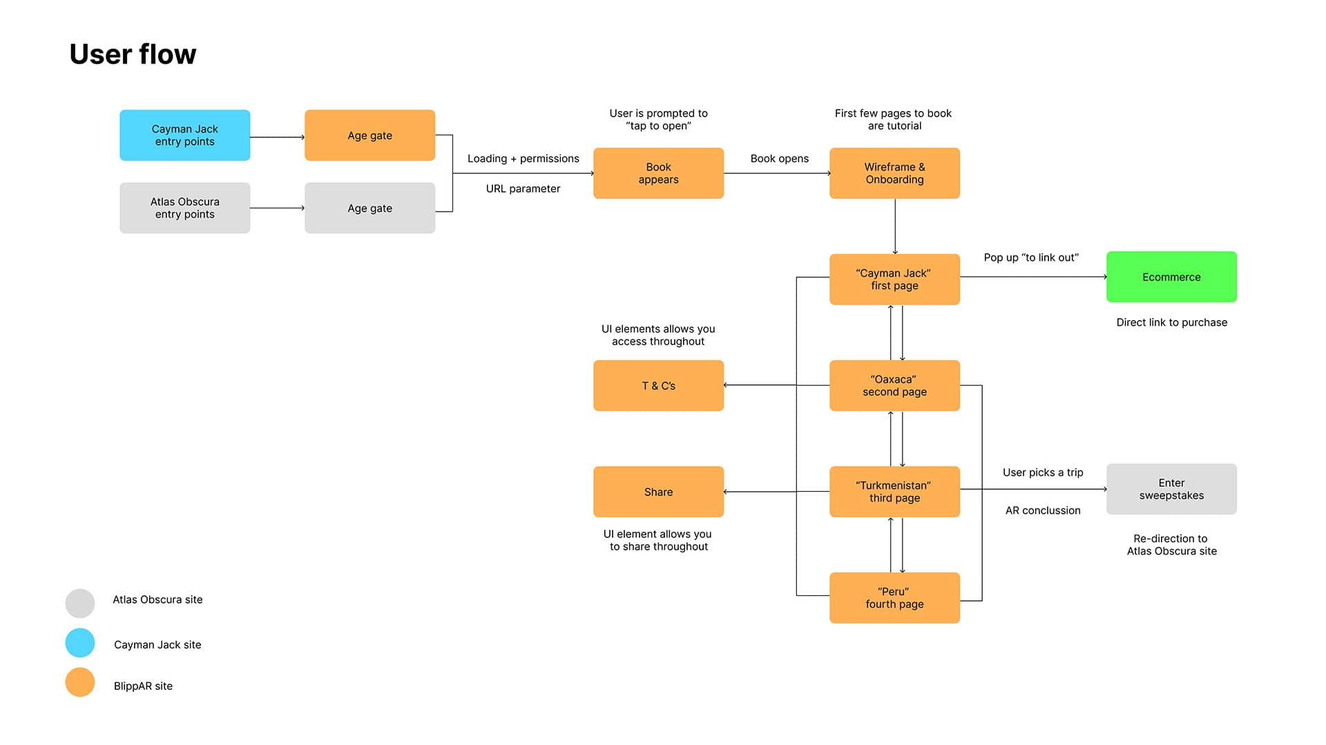
A client facing board was made. We established rough user journey was drawn up outlining where users enter and exit the experience, when the e-commerce and sweepstake sections would appear and each page of the AR journey. We also gave references as to how the locations and final appears should appear visually.
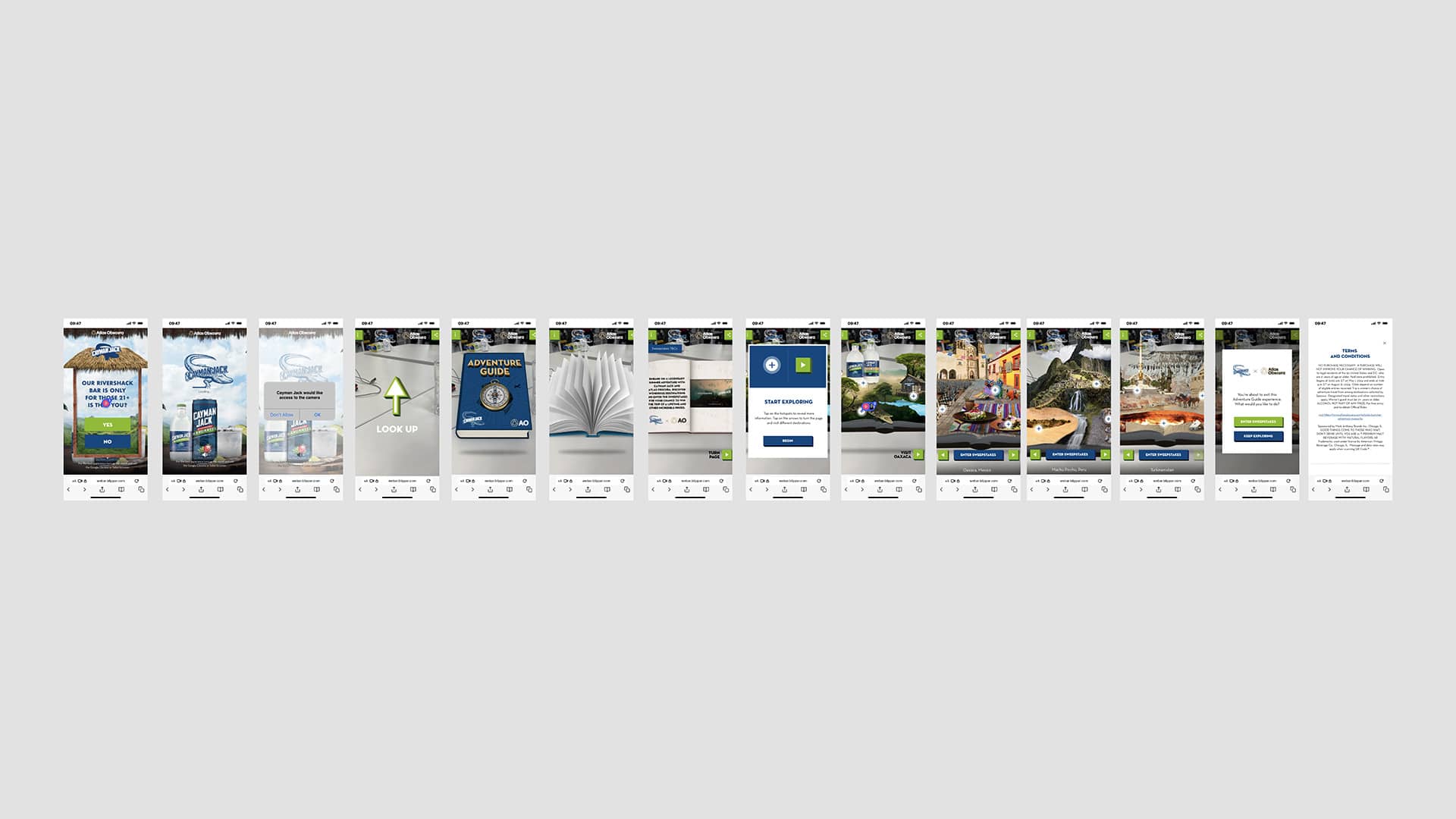
As a user I need to feel comfortable to allow access to my devices motion and camera settings.
As a company we need to clearly communicate that granting access to device motion and camera setting is required to create and Augmented experience but also to create trust so the user is comfortable doing so.
UX/UI
The project was marketed as being a Web-AR (app-less augmented reality) project.
Any user with a mobile (iOS and Android) would be able to view the campaign.
We created UX/UI screens for each page and developed a prototype with a test link.
Atlas and Obscure were encouraged to conduct desk research with their employers to try the link before the live link was released.
We noticed there was a 50% drop off rate on the access permission pages.
It came to our attention that users were put off by having to allow access and potentially didn’t understand Augmented reality.
We decided to hold a design sprint focused on the following user story.